Formations
:root {
–primary: #2D11E9;
–secondary:#EC6804;
–accent: #2600ff;
–dark: #0A0E27;
–light: #F8F9FA;
–neon-blue: #00D4FF;
–neon-purple: #2D11E9;
–neon-pink: #EC6804;
–glass: rgba(255, 255, 255, 0.05);
–glass-border: rgba(255, 255, 255, 0.1);
–text-primary: #FFFFFF;
–text-secondary: rgba(255, 255, 255, 0.832);
–gradient-cosmic: linear-gradient(135deg, #2D11E9 0%, #EC6804 25%, #EC6804 50%, #EC6804 75%, #2D11E9 100%);
–gradient-neon: linear-gradient(45deg, #3c00ff, #2D11E9, #EC6804);
–gradient-fire: linear-gradient(45deg, #EC6804, #1605ff, #EC6804);
}
* {
margin: 0;
padding: 0;
box-sizing: border-box;
}
body {
font-family: ‘Inter’, sans-serif;
background: #000;
color: var(–text-primary);
overflow-x: hidden;
cursor: none;
position: relative;
}
/* Custom Cursor System */
.cursor {
width: 40px;
height: 40px;
border: 2px solid var(–neon-blue);
border-radius: 50%;
position: fixed;
pointer-events: none;
z-index: 9999;
transition: all 0.1s ease;
transform: translate(-50%, -50%);
mix-blend-mode: difference;
}
.cursor-follower {
width: 8px;
height: 8px;
background: var(–neon-blue);
border-radius: 50%;
position: fixed;
pointer-events: none;
z-index: 9998;
transition: all 0.3s ease;
transform: translate(-50%, -50%);
box-shadow: 0 0 20px var(–neon-blue);
}
.cursor-trail {
position: fixed;
pointer-events: none;
z-index: 9997;
width: 100%;
height: 100%;
top: 0;
left: 0;
}
.trail-dot {
position: absolute;
width: 4px;
height: 4px;
background: var(–neon-blue);
border-radius: 50%;
pointer-events: none;
animation: fadeOut 1s ease forwards;
}
@keyframes fadeOut {
to {
opacity: 0;
transform: scale(0);
}
}
/* Revolutionary Loading Screen */
.loader {
position: fixed;
top: 0;
left: 0;
width: 100%;
height: 100%;
background: #000;
z-index: 10000;
display: flex;
justify-content: center;
align-items: center;
overflow: hidden;
}
.loader-content {
position: relative;
z-index: 2;
text-align: center;
}
.loader-logo {
width: 200px;
height: 200px;
position: relative;
margin: 0 auto 30px;
}
.loader-particle {
position: absolute;
width: 100%;
height: 100%;
border-radius: 50%;
border: 2px solid;
animation: rotate 3s linear infinite;
}
.loader-particle:nth-child(1) {
border-color: var(–neon-blue);
animation-delay: 0s;
}
.loader-particle:nth-child(2) {
border-color: var(–neon-purple);
animation-delay: 0.5s;
animation-direction: reverse;
}
.loader-particle:nth-child(3) {
border-color: var(–neon-pink);
animation-delay: 1s;
}
@keyframes rotate {
0% { transform: rotate(0deg) scale(1); }
50% { transform: rotate(180deg) scale(1.2); }
100% { transform: rotate(360deg) scale(1); }
}
.loader-text {
font-family: ‘Space Grotesk’, sans-serif;
font-size: 24px;
font-weight: 300;
letter-spacing: 4px;
background: var(–gradient-neon);
-webkit-background-clip: text;
background-clip: text;
-webkit-text-fill-color: transparent;
animation: pulse 2s ease infinite;
}
@keyframes pulse {
0%, 100% { opacity: 0.5; }
50% { opacity: 1; }
}
.loader-bg {
position: absolute;
top: 0;
left: 0;
width: 100%;
height: 100%;
background: radial-gradient(circle at center, rgba(0, 212, 255, 0.1) 0%, transparent 70%);
animation: loaderPulse 3s ease infinite;
}
@keyframes loaderPulse {
0%, 100% { transform: scale(1); opacity: 0.5; }
50% { transform: scale(1.5); opacity: 0.8; }
}
/* Quantum Navigation */
.quantum-nav {
position: fixed;
top: 0;
left: 0;
width: 100%;
z-index: 1000;
padding: 20px 40px;
background: linear-gradient(180deg, rgba(0, 0, 0, 0.8) 0%, transparent 100%);
backdrop-filter: blur(20px);
transition: all 0.5s ease;
}
.quantum-nav.scrolled {
background: rgba(0, 0, 0, 0.95);
padding: 15px 40px;
}
.nav-container {
max-width: 1400px;
margin: 0 auto;
display: flex;
justify-content: space-between;
align-items: center;
}
.quantum-logo {
font-family: ‘Space Grotesk’, sans-serif;
font-size: 28px;
font-weight: 900;
background: var(–gradient-neon);
-webkit-background-clip: text;
background-clip: text;
-webkit-text-fill-color: transparent;
text-decoration: none;
position: relative;
transition: all 0.3s ease;
}
.quantum-logo::before {
content: »;
position: absolute;
bottom: -5px;
left: 0;
width: 0;
height: 2px;
background: var(–gradient-neon);
transition: width 0.3s ease;
}
.quantum-logo:hover::before {
width: 100%;
}
.quantum-menu {
display: flex;
gap: 40px;
list-style: none;
}
.quantum-menu a {
color: var(–text-secondary);
text-decoration: none;
font-weight: 500;
position: relative;
transition: all 0.3s ease;
padding: 5px 0;
}
.quantum-menu a::before {
content: »;
position: absolute;
bottom: 0;
left: 0;
width: 0;
height: 1px;
background: var(–gradient-neon);
transition: width 0.3s ease;
}
.quantum-menu a:hover {
color: var(–text-primary);
}
.quantum-menu a:hover::before {
width: 100%;
}
.quantum-actions {
display: flex;
gap: 20px;
}
.quantum-btn {
padding: 12px 25px;
border-radius: 30px;
font-weight: 600;
text-decoration: none;
transition: all 0.3s ease;
position: relative;
overflow: hidden;
display: inline-block;
}
.quantum-btn-outline {
background: transparent;
color: var(–text-primary);
border: 1px solid rgba(255, 255, 255, 0.2);
}
.quantum-btn-outline:hover {
background: var(–glass);
border-color: var(–neon-blue);
box-shadow: 0 0 20px rgba(0, 212, 255, 0.3);
transform: translateY(-2px);
}
.quantum-btn-primary {
background: var(–gradient-neon);
color: white;
border: none;
box-shadow: 0 10px 30px rgba(0, 212, 255, 0.3);
}
.quantum-btn-primary:hover {
transform: translateY(-3px);
box-shadow: 0 15px 40px rgba(0, 212, 255, 0.5);
}
/* Revolutionary Hero Section */
.quantum-hero {
position: relative;
min-height: 100vh;
display: flex;
align-items: center;
justify-content: center;
overflow: hidden;
background: radial-gradient(ellipse at center, #0A0E27 0%, #000 100%);
}
.quantum-field {
position: absolute;
top: 0;
left: 0;
width: 100%;
height: 100%;
pointer-events: none;
}
.quantum-particle {
position: absolute;
width: 2px;
height: 2px;
background: var(–neon-blue);
border-radius: 50%;
box-shadow: 0 0 10px var(–neon-blue);
animation: quantumFloat 20s infinite linear;
}
@keyframes quantumFloat {
0% {
transform: translateY(100vh) translateX(0);
opacity: 0;
}
10% {
opacity: 1;
}
90% {
opacity: 1;
}
100% {
transform: translateY(-100vh) translateX(100px);
opacity: 0;
}
}
.quantum-grid {
position: absolute;
top: 0;
left: 0;
width: 100%;
height: 100%;
background-image:
linear-gradient(rgba(0, 212, 255, 0.1) 1px, transparent 1px),
linear-gradient(90deg, rgba(0, 212, 255, 0.1) 1px, transparent 1px);
background-size: 50px 50px;
animation: gridMove 10s linear infinite;
}
@keyframes gridMove {
0% { transform: translate(0, 0); }
100% { transform: translate(50px, 50px); }
}
.hero-content {
position: relative;
z-index: 10;
text-align: center;
max-width: 1200px;
padding: 0 10px;
}
.hero-badge {
display: inline-block;
padding: 10px 25px;
background: var(–glass);
backdrop-filter: blur(20px);
border: 1px solid var(–glass-border);
border-radius: 50px;
font-size: 14px;
font-weight: 600;
margin-bottom: 40px;
animation: fadeInDown 1s ease;
position: relative;
overflow: hidden;
}
.hero-badge::before {
content: »;
position: absolute;
top: 0;
left: -100%;
width: 100%;
height: 100%;
background: linear-gradient(90deg, transparent, rgba(0, 212, 255, 0.3), transparent);
animation: shimmer 3s infinite;
}
@keyframes shimmer {
0% { left: -100%; }
100% { left: 100%; }
}
@keyframes fadeInDown {
from {
opacity: 0;
transform: translateY(-50px);
}
to {
opacity: 1;
transform: translateY(0);
}
}
.hero-title {
font-family: ‘Space Grotesk’, sans-serif;
font-size: clamp(1.5rem, 2vw, 3rem);
font-weight: 990;
line-height: 1;
margin-bottom: 20px;
position: relative;
margin-top: -2rem;
}
.hero-title span {
display: block;
background: var(–gradient-cosmic);
background-size: 200% 200%;
-webkit-background-clip: text;
background-clip: text;
-webkit-text-fill-color: transparent;
animation: gradientShift 8s ease infinite;
text-shadow: 0 0 80px rgba(0, 212, 255, 0.5);
}
@keyframes gradientShift {
0% { background-position: 0% 50%; }
50% { background-position: 100% 50%; }
100% { background-position: 0% 50%; }
}
.hero-subtitle {
font-size: clamp(1rem, 2vw, 1.4rem);
font-weight: 600;
color: var(–text-secondary);
margin-bottom: 40px;
line-height: 1.6;
animation: fadeInUp 1s ease 0.3s both;
}
@keyframes fadeInUp {
from {
opacity: 0;
transform: translateY(50px);
}
to {
opacity: 1;
transform: translateY(0);
}
}
.hero-actions {
display: flex;
gap: 30px;
justify-content: center;
flex-wrap: wrap;
animation: fadeInUp 1s ease 0.6s both;
}
.hero-btn {
padding: 18px 45px;
font-size: 18px;
font-weight: 700;
text-decoration: none;
border-radius: 50px;
transition: all 0.4s cubic-bezier(0.175, 0.885, 0.32, 1.275);
position: relative;
overflow: hidden;
display: inline-block;
}
.hero-btn-primary {
background: var(–gradient-neon);
color: white;
box-shadow: 0 20px 40px rgba(0, 212, 255, 0.4);
}
.hero-btn-primary:hover {
transform: translateY(-5px) scale(1.05);
box-shadow: 0 25px 50px rgba(0, 212, 255, 0.6);
}
.hero-btn-secondary {
background: var(–glass);
backdrop-filter: blur(20px);
border: 2px solid var(–glass-border);
color: var(–text-primary);
}
.hero-btn-secondary:hover {
background: rgba(255, 255, 255, 0.1);
border-color: var(–neon-blue);
transform: translateY(-5px) scale(1.05);
box-shadow: 0 20px 40px rgba(0, 212, 255, 0.3);
}
.hero-btn::before {
content: »;
position: absolute;
top: 0;
left: -100%;
width: 100%;
height: 100%;
background: linear-gradient(90deg, transparent, rgba(255, 255, 255, 0.3), transparent);
transition: left 0.5s;
}
.hero-btn:hover::before {
left: 100%;
}
/* Floating Orbs */
.orb {
position: absolute;
border-radius: 50%;
filter: blur(40px);
opacity: 0.4;
animation: orbFloat 20s infinite ease-in-out;
}
.orb-1 {
width: 300px;
height: 300px;
background: var(–neon-blue);
top: 10%;
left: 10%;
animation-delay: 0s;
}
.orb-2 {
width: 200px;
height: 200px;
background: var(–neon-purple);
top: 60%;
right: 15%;
animation-delay: 5s;
}
.orb-3 {
width: 250px;
height: 250px;
background: var(–neon-pink);
bottom: 20%;
left: 20%;
animation-delay: 10s;
}
@keyframes orbFloat {
0%, 100% {
transform: translate(0, 0) scale(1);
}
33% {
transform: translate(100px, -100px) scale(1.2);
}
66% {
transform: translate(-100px, 100px) scale(0.8);
}
}
/* Filter Section */
.filter-section {
padding: 80px 20px;
background: linear-gradient(180deg, #000 0%, #0A0E27 100%);
position: relative;
}
.filter-container {
max-width: 1400px;
margin: 0 auto;
}
.filter-header {
display: flex;
justify-content: space-between;
align-items: center;
margin-bottom: 40px;
flex-wrap: wrap;
gap: 20px;
}
.filter-title {
font-family: ‘Space Grotesk’, sans-serif;
font-size: clamp(2rem, 4vw, 3rem);
font-weight: 900;
background: var(–gradient-neon);
-webkit-background-clip: text;
background-clip: text;
-webkit-text-fill-color: transparent;
}
.filter-controls {
display: flex;
gap: 20px;
flex-wrap: wrap;
}
.filter-btn {
padding: 12px 25px;
background: var(–glass);
backdrop-filter: blur(20px);
border: 1px solid var(–glass-border);
border-radius: 50px;
color: var(–text-primary);
font-weight: 600;
cursor: pointer;
transition: all 0.3s ease;
position: relative;
overflow: hidden;
}
.filter-btn:hover {
background: rgba(255, 255, 255, 0.1);
border-color: var(–neon-blue);
transform: translateY(-2px);
box-shadow: 0 10px 20px rgba(0, 212, 255, 0.2);
}
.filter-btn.active {
background: var(–gradient-neon);
color: white;
border-color: transparent;
}
/* Courses Section */
.courses-section {
padding: 80px 20px;
background: linear-gradient(180deg, #0A0E27 0%, #000 100%);
position: relative;
}
.courses-container {
max-width: 1400px;
margin: 0 auto;
}
.courses-grid {
display: grid;
grid-template-columns: repeat(auto-fill, minmax(380px, 1fr));
gap: 40px;
margin-top: 60px;
}
.course-card {
background: var(–glass);
backdrop-filter: blur(20px);
border: 1px solid var(–glass-border);
border-radius: 30px;
overflow: hidden;
transition: all 0.5s cubic-bezier(0.175, 0.885, 0.32, 1.275);
position: relative;
opacity: 0;
transform: translateY(50px) scale(0.9);
}
.course-card.visible {
opacity: 1;
transform: translateY(0) scale(1);
}
.course-card:hover {
transform: translateY(-20px) scale(1.02);
border-color: var(–neon-blue);
box-shadow: 0 30px 60px rgba(0, 212, 255, 0.3);
}
.course-card::before {
content: »;
position: absolute;
top: 0;
left: 0;
right: 0;
height: 4px;
background: var(–gradient-neon);
transform: scaleX(0);
transform-origin: left;
transition: transform 0.5s ease;
}
.course-card:hover::before {
transform: scaleX(1);
}
.course-image {
position: relative;
height: aauto;
overflow: hidden;
}
.course-image img {
width: 100%;
height: 100%;
object-fit: cover;
transition: transform 0.5s ease;
}
.course-card:hover .course-image img {
transform: scale(1.1);
}
.course-badge {
position: absolute;
top: 20px;
left: 20px;
padding: 8px 16px;
background: var(–gradient-neon);
color: white;
border-radius: 50px;
font-size: 12px;
font-weight: 700;
text-transform: uppercase;
letter-spacing: 1px;
box-shadow: 0 5px 15px rgba(0, 212, 255, 0.3);
}
.course-duration {
position: absolute;
bottom: 20px;
right: 20px;
padding: 8px 16px;
background: rgba(0, 0, 0, 0.7);
backdrop-filter: blur(10px);
color: white;
border-radius: 50px;
font-size: 14px;
font-weight: 600;
display: flex;
align-items: center;
gap: 8px;
}
.course-content {
padding: 30px;
}
.course-category {
display: inline-block;
padding: 6px 12px;
background: rgba(0, 212, 255, 0.1);
border: 1px solid rgba(0, 212, 255, 0.3);
border-radius: 50px;
font-size: 12px;
font-weight: 600;
color: var(–neon-blue);
margin-bottom: 15px;
}
.course-title {
font-family: ‘Space Grotesk’, sans-serif;
font-size: 22px;
font-weight: 700;
margin-bottom: 15px;
color: var(–text-primary);
line-height: 1.3;
}
.course-instructor {
display: flex;
align-items: center;
gap: 10px;
margin-bottom: 20px;
}
.instructor-avatar {
width: 30px;
height: 30px;
border-radius: 50%;
background: var(–gradient-neon);
display: flex;
align-items: center;
justify-content: center;
color: white;
font-weight: 700;
font-size: 14px;
}
.instructor-name {
font-size: 14px;
color: var(–text-secondary);
}
.course-rating {
display: flex;
align-items: center;
gap: 10px;
margin-bottom: 20px;
}
.rating-stars {
color: var(–accent);
font-size: 14px;
}
.rating-count {
font-size: 14px;
color: var(–text-secondary);
}
.course-price {
display: flex;
align-items: center;
gap: 15px;
margin-bottom: 25px;
}
.price-current {
font-size: 28px;
font-weight: 900;
background: var(–gradient-neon);
-webkit-background-clip: text;
background-clip: text;
-webkit-text-fill-color: transparent;
}
.price-original {
font-size: 18px;
color: var(–text-secondary);
text-decoration: line-through;
}
.price-discount {
padding: 4px 8px;
background: var(–gradient-fire);
color: white;
border-radius: 8px;
font-size: 12px;
font-weight: 700;
}
.course-btn {
width: 100%;
padding: 15px;
background: var(–gradient-neon);
color: white;
border: none;
border-radius: 50px;
font-size: 16px;
font-weight: 700;
cursor: pointer;
transition: all 0.3s ease;
text-decoration: none;
display: inline-block;
text-align: center;
}
.course-btn:hover {
transform: translateY(-3px);
box-shadow: 0 15px 30px rgba(0, 212, 255, 0.4);
}
/* Categories Section */
.categories-section {
padding: 0 20px 80px 20px;
background: linear-gradient(180deg, #000 0%, #0A0E27 100%);
position: relative;
}
.categories-container {
max-width: 1400px;
margin: 0 auto;
}
.categories-grid {
display: grid;
grid-template-columns: repeat(auto-fit, minmax(250px, 1fr));
gap: 30px;
margin-top: 60px;
}
.category-card {
background: var(–glass);
backdrop-filter: blur(20px);
border: 1px solid var(–glass-border);
border-radius: 30px;
padding: 40px 30px;
text-align: center;
transition: all 0.5s cubic-bezier(0.175, 0.885, 0.32, 1.275);
position: relative;
overflow: hidden;
opacity: 0;
transform: translateY(50px) scale(0.9);
}
.category-card.visible {
opacity: 1;
transform: translateY(0) scale(1);
}
.category-card:hover {
transform: translateY(-20px) scale(1.05);
border-color: var(–neon-blue);
box-shadow: 0 30px 60px rgba(0, 212, 255, 0.3);
}
.category-icon {
width: 80px;
height: 80px;
background: var(–gradient-neon);
border-radius: 20px;
display: flex;
align-items: center;
justify-content: center;
margin: 0 auto 20px;
font-size: 36px;
color: white;
position: relative;
animation: iconFloat 3s ease-in-out infinite;
}
@keyframes iconFloat {
0%, 100% { transform: translateY(0); }
50% { transform: translateY(-10px); }
}
.category-title {
font-size: 20px;
font-weight: 700;
margin-bottom: 10px;
color: var(–text-primary);
}
.category-count {
font-size: 16px;
color: var(–text-secondary);
}
/* CTA Section */
.cta-section {
padding: 0 20px 80px 20px;
background: var(–gradient-neon);
position: relative;
overflow: hidden;
}
.cta-container {
max-width: 1000px;
margin: 0 auto;
text-align: center;
position: relative;
z-index: 2;
}
.cta-title {
font-family: ‘Space Grotesk’, sans-serif;
font-size: clamp(1.4rem, 2vw, 3rem);
font-weight: 900;
color: white;
margin-bottom: 30px;
text-shadow: 0 10px 40px rgba(0, 0, 0, 0.3);
}
.cta-description {
font-size: 22px;
color: rgba(255, 255, 255, 0.9);
margin-bottom: 50px;
line-height: 1.6;
}
.cta-btn {
padding: 20px 50px;
background: white;
color: var(–primary);
font-size: 20px;
font-weight: 700;
text-decoration: none;
border-radius: 50px;
transition: all 0.4s ease;
display: inline-block;
box-shadow: 0 20px 40px rgba(0, 0, 0, 0.2);
}
.cta-btn:hover {
transform: translateY(-10px) scale(1.05);
box-shadow: 0 30px 60px rgba(0, 0, 0, 0.3);
}
.cta-bg-effect {
position: absolute;
top: 0;
left: 0;
width: 100%;
height: 100%;
background: url(‘data:image/svg+xml,‘) no-repeat bottom;
background-size: cover;
opacity: 0.3;
}
/* Footer */
.quantum-footer {
background: #000;
padding: 80px 20px 40px;
position: relative;
overflow: hidden;
}
.footer-container {
max-width: 1400px;
margin: 0 auto;
display: grid;
grid-template-columns: repeat(auto-fit, minmax(300px, 1fr));
gap: 60px;
margin-bottom: 60px;
}
.footer-column h3 {
font-family: ‘Space Grotesk’, sans-serif;
font-size: 24px;
font-weight: 700;
margin-bottom: 30px;
background: var(–gradient-neon);
-webkit-background-clip: text;
background-clip: text;
-webkit-text-fill-color: transparent;
}
.footer-column p {
color: var(–text-secondary);
line-height: 1.6;
margin-bottom: 30px;
}
.footer-links {
list-style: none;
}
.footer-links li {
margin-bottom: 15px;
}
.footer-links a {
color: var(–text-secondary);
text-decoration: none;
transition: all 0.3s ease;
position: relative;
padding-left: 20px;
}
.footer-links a::before {
content: ‘→’;
position: absolute;
left: 0;
color: var(–neon-blue);
transition: transform 0.3s ease;
}
.footer-links a:hover {
color: var(–text-primary);
padding-left: 30px;
}
.footer-links a:hover::before {
transform: translateX(10px);
}
.social-links {
display: flex;
gap: 20px;
margin-top: 30px;
}
.social-link {
width: 50px;
height: 50px;
background: var(–glass);
backdrop-filter: blur(20px);
border: 1px solid var(–glass-border);
border-radius: 50%;
display: flex;
align-items: center;
justify-content: center;
color: var(–text-primary);
text-decoration: none;
transition: all 0.3s ease;
font-size: 20px;
}
.social-link:hover {
background: var(–gradient-neon);
color: white;
transform: translateY(-10px) rotate(360deg);
box-shadow: 0 20px 40px rgba(0, 212, 255, 0.5);
}
.footer-bottom {
border-top: 1px solid var(–glass-border);
padding-top: 40px;
text-align: center;
color: var(–text-secondary);
font-size: 14px;
}
/* Scroll Progress */
.scroll-progress {
position: fixed;
top: 0;
left: 0;
width: 0%;
height: 3px;
background: var(–gradient-neon);
z-index: 9999;
transition: width 0.1s ease;
box-shadow: 0 0 10px var(–neon-blue);
}
/* Mobile Menu */
.mobile-menu-toggle {
display: none;
background: transparent;
border: none;
color: var(–text-primary);
font-size: 24px;
cursor: pointer;
position: relative;
z-index: 1001;
}
.mobile-menu {
position: fixed;
top: 0;
right: -100%;
width: 80%;
max-width: 400px;
height: 100%;
background: rgba(0, 0, 0, 0.95);
backdrop-filter: blur(20px);
z-index: 1000;
transition: right 0.5s ease;
padding: 100px 40px;
overflow-y: auto;
}
.mobile-menu.active {
right: 0;
}
.mobile-menu-list {
list-style: none;
}
.mobile-menu-list li {
margin-bottom: 30px;
}
.mobile-menu-list a {
color: var(–text-primary);
text-decoration: none;
font-size: 20px;
font-weight: 500;
transition: all 0.3s ease;
}
.mobile-menu-list a:hover {
color: var(–neon-blue);
padding-left: 20px;
}
/* Responsive Design */
@media (max-width: 1024px) {
.quantum-menu {
display: none;
}
.mobile-menu-toggle {
display: none;
}
.courses-grid {
grid-template-columns: repeat(auto-fill, minmax(320px, 1fr));
}
.filter-header {
flex-direction: column;
align-items: flex-start;
}
.filter-controls {
width: 100%;
justify-content: flex-start;
}
}
@media (max-width: 768px) {
.cursor, .cursor-follower, .cursor-trail {
display: none;
}
body {
cursor: auto;
}
.hero-title {
font-size: 3rem;
}
.courses-grid {
grid-template-columns: 1fr;
}
.categories-grid {
grid-template-columns: repeat(2, 1fr);
}
.footer-container {
grid-template-columns: 1fr;
}
}
/* Animations */
.fade-in {
opacity: 0;
transform: translateY(50px);
transition: all 0.8s ease;
}
.fade-in.visible {
opacity: 1;
transform: translateY(0);
}
.scale-in {
opacity: 0;
transform: scale(0.8);
transition: all 0.8s ease;
}
.scale-in.visible {
opacity: 1;
transform: scale(1);
}
/* Glitch Effect */
.glitch {
position: relative;
animation: glitch 2s infinite;
}
@keyframes glitch {
0%, 100% {
text-shadow:
2px 2px 0 var(–neon-blue),
-2px -2px 0 var(–neon-purple);
}
25% {
text-shadow:
-2px 2px 0 var(–neon-pink),
2px -2px 0 var(–neon-blue);
}
50% {
text-shadow:
2px -2px 0 var(–neon-purple),
-2px 2px 0 var(–neon-pink);
}
75% {
text-shadow:
-2px -2px 0 var(–neon-blue),
2px 2px 0 var(–neon-purple);
}
}
/* ========================================
RESPONSIVITÉ COMPLÈTE – TOUS LES ÉCRANS
======================================== */
/* Points de rupture définis */
:root {
–breakpoint-xs: 320px; /* Très petits écrans */
–breakpoint-sm: 576px; /* Petits écrans (mobile) */
–breakpoint-md: 768px; /* Tablettes */
–breakpoint-lg: 992px; /* Ordinateurs portables */
–breakpoint-xl: 1200px; /* Ordinateurs de bureau */
–breakpoint-xxl: 1400px; /* Grands écrans */
}
/* ========================================
BASE – MOBILE FIRST APPROACH
======================================== */
/* Très petits écrans (320px et plus) */
@media screen and (min-width: 320px) {
/* Navigation */
.quantum-nav {
padding: 15px 20px;
}
.nav-container {
flex-direction: column;
gap: 15px;
}
.quantum-logo {
font-size: 20px;
}
.quantum-menu {
display: none;
}
.mobile-menu-toggle {
display: none;
position: absolute;
top: 20px;
right: 20px;
z-index: -1002;
}
/* Hero Section */
.hero-title {
font-size: 2rem;
line-height: 1.2;
}
.hero-subtitle {
font-size: 1rem;
padding: 0 10px;
}
.hero-actions {
flex-direction: column;
gap: 15px;
width: 100%;
padding: 0 20px;
}
.hero-btn {
width: 100%;
padding: 15px 25px;
font-size: 16px;
}
/* Curseur – Désactivé sur mobile */
.cursor,
.cursor-follower,
.cursor-trail {
display: none !important;
}
body {
cursor: auto !important;
}
/* Filter Section */
.filter-header {
flex-direction: column;
align-items: stretch;
gap: 20px;
}
.filter-title {
font-size: 1.8rem;
text-align: center;
}
.filter-controls {
display: grid;
grid-template-columns: repeat(2, 1fr);
gap: 10px;
width: 100%;
}
.filter-btn {
font-size: 14px;
padding: 10px 15px;
}
.filter-search {
width: 100%;
order: -1;
}
.filter-search input {
font-size: 16px; /* Prevent zoom on iOS */
}
/* Categories Grid */
.categories-grid {
grid-template-columns: repeat(2, 1fr);
gap: 15px;
}
.category-card {
padding: 25px 15px;
}
.category-icon {
width: 60px;
height: 60px;
font-size: 28px;
}
.category-title {
font-size: 16px;
}
/* Courses Grid */
.courses-grid {
grid-template-columns: 1fr;
gap: 25px;
}
.course-card {
margin: 0 10px;
}
.course-image {
height: 180px;
}
.course-content {
padding: 20px;
}
.course-title {
font-size: 18px;
line-height: 1.4;
}
.course-price {
flex-direction: column;
align-items: flex-start;
gap: 10px;
}
.price-current {
font-size: 24px;
}
.price-original {
font-size: 16px;
}
/* Footer */
.footer-container {
grid-template-columns: 1fr;
gap: 30px;
text-align: center;
}
.social-links {
justify-content: center;
}
}
/* Petits écrans (576px et plus) */
@media screen and (min-width: 576px) {
/* Navigation */
.quantum-nav {
padding: 15px 30px;
}
.nav-container {
flex-direction: row;
justify-content: space-between;
}
.quantum-logo {
font-size: 24px;
}
/* Hero Section */
.hero-title {
font-size: 2.5rem;
}
.hero-subtitle {
font-size: 1.1rem;
padding: 0 20px;
}
.hero-actions {
flex-direction: row;
justify-content: center;
width: auto;
padding: 0;
}
.hero-btn {
width: auto;
min-width: 180px;
}
/* Filter Section */
.filter-controls {
grid-template-columns: repeat(3, 1fr);
}
.filter-search {
order: 0;
width: 100%;
max-width: 400px;
margin: 0 auto;
}
/* Categories Grid */
.categories-grid {
grid-template-columns: repeat(3, 1fr);
gap: 20px;
}
.category-card {
padding: 30px 20px;
}
.category-icon {
width: 70px;
height: 70px;
font-size: 32px;
}
.category-title {
font-size: 18px;
}
/* Courses Grid */
.courses-grid {
grid-template-columns: repeat(2, 1fr);
gap: 30px;
}
.course-card {
margin: 0;
}
.course-image {
height: 200px;
}
.course-content {
padding: 25px;
}
.course-title {
font-size: 20px;
}
/* CTA Section */
.cta-title {
font-size: 2.5rem;
}
.cta-description {
font-size: 18px;
}
}
/* Tablettes (768px et plus) */
@media screen and (min-width: 768px) {
/* Navigation */
.quantum-nav {
padding: 20px 40px;
}
.quantum-menu {
display: flex;
gap: 30px;
}
.mobile-menu-toggle {
display: none;
}
.quantum-actions {
display: flex;
}
/* Hero Section */
.hero-title {
font-size: 3.5rem;
}
.hero-subtitle {
font-size: 1.3rem;
max-width: 600px;
margin: 0 auto 40px;
}
/* Filter Section */
.filter-header {
flex-direction: row;
align-items: center;
justify-content: space-between;
flex-wrap: wrap;
gap: 30px;
}
.filter-title {
font-size: 2.2rem;
text-align: left;
}
.filter-controls {
display: flex;
flex-wrap: wrap;
gap: 15px;
}
.filter-search {
width: 300px;
order: 0;
}
/* Categories Grid */
.categories-grid {
grid-template-columns: repeat(3, 1fr);
gap: 25px;
}
.category-card {
padding: 35px 25px;
}
.category-icon {
width: 80px;
height: 80px;
font-size: 36px;
}
.category-title {
font-size: 20px;
}
/* Courses Grid */
.courses-grid {
grid-template-columns: repeat(2, 1fr);
gap: 35px;
}
.course-image {
height: 220px;
}
.course-content {
padding: 30px;
}
.course-title {
font-size: 22px;
}
/* Section Headers */
.section-title {
font-size: 2.5rem;
}
.section-subtitle {
font-size: 18px;
max-width: 700px;
}
/* Footer */
.footer-container {
grid-template-columns: repeat(2, 1fr);
gap: 40px;
text-align: left;
}
.social-links {
justify-content: flex-start;
}
}
/* Ordinateurs portables (992px et plus) */
@media screen and (min-width: 992px) {
/* Navigation */
.quantum-nav {
padding: 20px 40px;
}
.quantum-menu {
gap: 40px;
}
/* Hero Section */
.hero-title {
font-size: 3rem;
}
.hero-subtitle {
font-size: 1.4rem;
max-width: 700px;
}
/* Filter Section */
.filter-controls {
gap: 20px;
}
.filter-btn {
padding: 12px 25px;
font-size: 16px;
}
/* Categories Grid */
.categories-grid {
grid-template-columns: repeat(3, 1fr);
gap: 30px;
}
/* Courses Grid */
.courses-grid {
grid-template-columns: repeat(3, 1fr);
gap: 40px;
}
.course-image {
height: 200px;
}
.course-content {
padding: 30px;
}
.course-title {
font-size: 20px;
}
/* Section Headers */
.section-title {
font-size: 3rem;
}
.section-subtitle {
font-size: 20px;
max-width: 800px;
}
/* CTA Section */
.cta-title {
font-size: 3.5rem;
}
.cta-description {
font-size: 20px;
max-width: 700px;
margin: 0 auto 50px;
}
/* Footer */
.footer-container {
grid-template-columns: repeat(4, 1fr);
gap: 50px;
}
}
/* Ordinateurs de bureau (1200px et plus) */
@media screen and (min-width: 1200px) {
/* Navigation */
.quantum-nav {
padding: 20px 40px;
}
/* Hero Section */
.hero-title {
font-size: 5rem;
}
.hero-subtitle {
font-size: 1.5rem;
max-width: 800px;
}
/* Filter Section */
.filter-search {
width: 350px;
}
/* Categories Grid */
.categories-grid {
grid-template-columns: repeat(6, 1fr);
}
.category-card {
padding: 40px 30px;
}
/* Courses Grid */
.courses-grid {
grid-template-columns: repeat(4, 1fr);
gap: 40px;
}
.course-image {
height: 200px;
}
.course-content {
padding: 30px;
}
.course-title {
font-size: 20px;
}
/* Section Headers */
.section-title {
font-size: 3.5rem;
}
.section-subtitle {
font-size: 22px;
max-width: 900px;
}
/* CTA Section */
.cta-title {
font-size: 4rem;
}
.cta-description {
font-size: 22px;
max-width: 800px;
}
}
/* Grands écrans (1400px et plus) */
@media screen and (min-width: 1400px) {
/* Container max-width adjustments */
.nav-container,
.filter-container,
.categories-container,
.courses-container,
.cta-container {
max-width: 1400px;
}
/* Hero Section */
.hero-title {
font-size: 3rem;
}
.hero-subtitle {
font-size: 1.6rem;
max-width: 900px;
}
/* Filter Section */
.filter-search {
width: 400px;
}
/* Courses Grid */
.courses-grid {
grid-template-columns: repeat(4, 1fr);
gap: 50px;
}
.course-image {
height: 220px;
}
.course-content {
padding: 35px;
}
.course-title {
font-size: 22px;
}
/* Section Headers */
.section-title {
font-size: 4rem;
}
.section-subtitle {
font-size: 24px;
max-width: 1000px;
}
/* CTA Section */
.cta-title {
font-size: 4rem;
}
.cta-description {
font-size: 24px;
max-width: 900px;
}
}
/* ========================================
ORIENTATION SPÉCIFIQUE
======================================== */
/* Paysage – Petits écrans */
@media screen and (max-width: 767px) and (orientation: landscape) {
.hero-title {
font-size: 2rem;
}
.hero-subtitle {
font-size: 1rem;
margin-bottom: 20px;
}
.hero-actions {
flex-direction: row;
gap: 15px;
}
.hero-btn {
min-width: 150px;
padding: 12px 20px;
font-size: 14px;
}
.filter-controls {
grid-template-columns: repeat(4, 1fr);
}
.categories-grid {
grid-template-columns: repeat(3, 1fr);
}
.courses-grid {
grid-template-columns: repeat(2, 1fr);
}
}
/* Portrait – Tablettes */
@media screen and (min-width: 768px) and (max-width: 1023px) and (orientation: portrait) {
.hero-title {
font-size: 2.5rem;
}
.filter-controls {
grid-template-columns: repeat(2, 1fr);
}
.categories-grid {
grid-template-columns: repeat(2, 1fr);
}
.courses-grid {
grid-template-columns: repeat(2, 1fr);
}
}
/* ========================================
HIGH DPI DISPLAYS (RETINA)
======================================== */
@media only screen and (-webkit-min-device-pixel-ratio: 2),
only screen and (min-resolution: 192dpi) {
/* Amélioration du rendu pour les écrans haute densité */
.hero-title,
.section-title,
.course-title {
-webkit-font-smoothing: antialiased;
-moz-osx-font-smoothing: grayscale;
}
.course-image img {
image-rendering: -webkit-optimize-contrast;
image-rendering: crisp-edges;
}
}
/* ========================================
IMPRESSION
======================================== */
@media print {
/* Cache les éléments non nécessaires pour l’impression */
.cursor,
.cursor-follower,
.cursor-trail,
.quantum-field,
.quantum-grid,
.orb,
.hero-actions,
.filter-section,
.cta-section,
.social-links {
display: none !important;
}
/* Ajustements pour l’impression */
body {
background: white !important;
color: black !important;
font-size: 12pt;
}
.quantum-nav {
background: white !important;
color: black !important;
box-shadow: none !important;
}
.course-card {
break-inside: avoid;
border: 1px solid #ccc !important;
margin-bottom: 20px;
}
.course-title {
color: black !important;
}
.price-current {
color: black !important;
}
}
/* ========================================
ACCESSIBILITÉ – RÉDUCTION DE MOUVEMENT
======================================== */
@media (prefers-reduced-motion: reduce) {
/* Désactive les animations pour les utilisateurs qui préfèrent moins de mouvement */
*,
*::before,
*::after {
animation-duration: 0.01ms !important;
animation-iteration-count: 1 !important;
transition-duration: 0.01ms !important;
scroll-behavior: auto !important;
}
.quantum-particle,
.orb,
.trail-dot {
display: none !important;
}
.hero-title span {
animation: none !important;
}
.course-card:hover {
transform: none !important;
}
}
/* ========================================
MODE SOMBRE/FONCE (DARK MODE)
======================================== */
@media (prefers-color-scheme: dark) {
/* Le site est déjà en mode sombre, mais on peut ajuster certains éléments */
:root {
–glass: rgba(255, 255, 255, 0.03);
–glass-border: rgba(255, 255, 255, 0.08);
}
}
/* ========================================
MODE CLAIR (LIGHT MODE) – OPTIONNEL
======================================== */
@media (prefers-color-scheme: light) {
/* Si vous voulez supporter le mode clair */
:root {
–dark: #F8F9FA;
–light: #FFFFFF;
–text-primary: #2D3748;
–text-secondary: #4A5568;
–glass: rgba(0, 0, 0, 0.05);
–glass-border: rgba(0, 0, 0, 0.1);
}
body {
background: var(–light);
color: var(–text-primary);
}
.quantum-nav {
background: rgba(255, 255, 255, 0.95);
}
.quantum-logo,
.section-title,
.hero-title span {
background: var(–gradient-neon);
-webkit-background-clip: text;
background-clip: text;
-webkit-text-fill-color: transparent;
}
}
/* ========================================
SUPPORT DES APPAREILS TACTILES
======================================== */
@media (hover: none) and (pointer: coarse) {
/* Ajustements pour les appareils tactiles */
.course-card:hover {
transform: none !important;
}
.category-card:hover {
transform: none !important;
}
.filter-btn:hover {
transform: none !important;
}
.hero-btn:hover {
transform: none !important;
}
/* Augmentation de la taille des zones cliquables */
.filter-btn {
min-height: 44px;
min-width: 44px;
}
.course-btn {
min-height: 44px;
}
}
/* ========================================
NAVIGATEURS SPÉCIFIQUES
======================================== */
/* Safari */
@supports (-webkit-appearance: none) {
.filter-search input {
-webkit-appearance: none;
border-radius: 50px;
}
.course-btn {
-webkit-appearance: none;
}
}
/* Firefox */
@supports (-moz-appearance: none) {
.filter-search input {
-moz-appearance: none;
border-radius: 50px;
}
}
/* Edge */
@supports (-ms-ime-align: auto) {
.course-image img {
-ms-interpolation-mode: bicubic;
}
}
/* ========================================
UTILITAIRES RESPONSIVES
======================================== */
/* Classes utilitaires pour la responsivité */
.hidden-xs {
display: none;
}
@media (min-width: 576px) {
.hidden-xs {
display: block;
}
.hidden-sm {
display: none;
}
}
@media (min-width: 768px) {
.hidden-sm {
display: block;
}
.hidden-md {
display: none;
}
}
@media (min-width: 992px) {
.hidden-md {
display: block;
}
.hidden-lg {
display: none;
}
}
@media (min-width: 1200px) {
.hidden-lg {
display: block;
}
.hidden-xl {
display: none;
}
}
/* Texte responsive */
.text-responsive {
font-size: clamp(1rem, 2.5vw, 1.5rem);
}
.title-responsive {
font-size: clamp(2rem, 5vw, 4rem);
}
/* Espacement responsive */
.padding-responsive {
padding: clamp(1rem, 3vw, 2rem);
}
.margin-responsive {
margin: clamp(1rem, 3vw, 2rem);
}
/* ========================================
OPTIMISATIONS PERFORMANCE
======================================== */
/* Containment pour optimiser les repaints */
.course-card,
.category-card,
.filter-btn {
contain: layout style paint;
}
/* Will-change pour les animations */
.hero-title span,
.course-card:hover,
.category-card:hover {
will-change: transform;
}
/* Hardware acceleration */
.quantum-nav,
.hero-content,
.course-image img {
transform: translateZ(0);
backface-visibility: hidden;
perspective: 1000px;
}
FORMATIONS
Maîtrisez les
compétences
numériques
du futur
Découvrez nos formations pratiques et interactives conçues pour vous transformer en expert du digital. De la création de contenu à la monétisation, devenez autonome et performant.
Explorez par domaine
Marketing Digital
3 formations
Montage Vidéo
4 formations
Design Graphique
2 formations
Développement Web
1 formation
Bureautique
2 formations
Logiciels
1 formation
Formations disponibles

POPULAIRE
À votre rythme
Marketing Digital
Maîtrise Totale de Sora 2 & Création de Contenu Vidéo Monétisé sur TikTok
G
Par Germos
20 000 CFA
40 000 CFA
-50%
S’inscrire maintenant

7h
Marketing Digital
Marketing Digital – Le guide complet, toutes stratégies dévoilées pour réussir pleinement
G
Par Germos
30 000 CFA
50 000 CFA
-40%
S’inscrire maintenant

8h
Développement Web
Apprendre à créer site web avec WORDPRESS
G
Par Germos
60 000 CFA
120 000 CFA
-50%
S’inscrire maintenant

À votre rythme
Informatique
BUREAUTIQUE – MAÎTRISE D’OUTILS INFORMATIQUES
G
Par Germos
(1)
25 000 CFA
60 000 CFA
-58%
S’inscrire maintenant

3h 20m
Marketing Digital
TOKTOK MASTERY Africa – Les Trois manières fiables de gagner de l’Argent sur TikTok
G
Par Germos
(1)
15 000 CFA
40 000 CFA
-62%
S’inscrire maintenant

6h 27m
Design Graphique
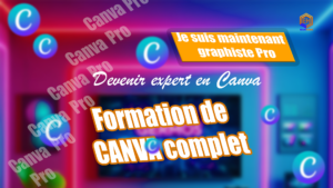
FORMATION COMPLÈTE SUR CANVA
G
Par Germos
20 000 CFA
50 000 CFA
-60%
S’inscrire maintenant

6h
Informatique
MONTAGE VIDÉO MOBILE AVEC LA RÉVOLUTION DE L’IA
G
Par Germos
20 000 CFA
65 000 CFA
-69%
S’inscrire maintenant

À votre rythme
Informatique
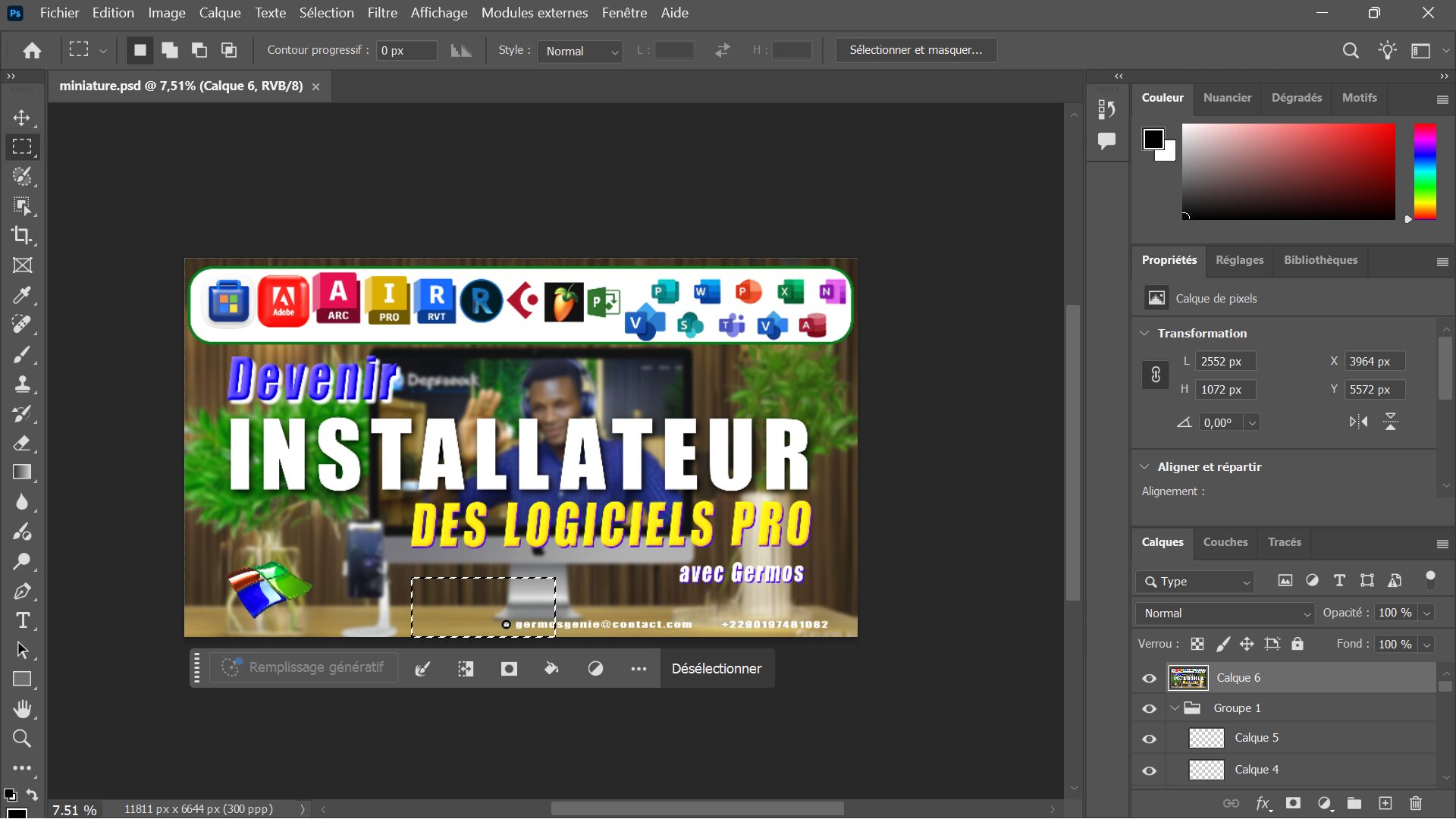
Devenir INSTALLATEUR des logiciels professionnels
G
Par Germos
15 000 CFA
80 000 CFA
-81%
S’inscrire maintenant
45m
Design Graphique
MAITRISE DE PHOTOSHOP AVEC AI
G
Par Germos
25 000 CFA
65 000 CFA
-62%
S’inscrire maintenant
À votre rythme
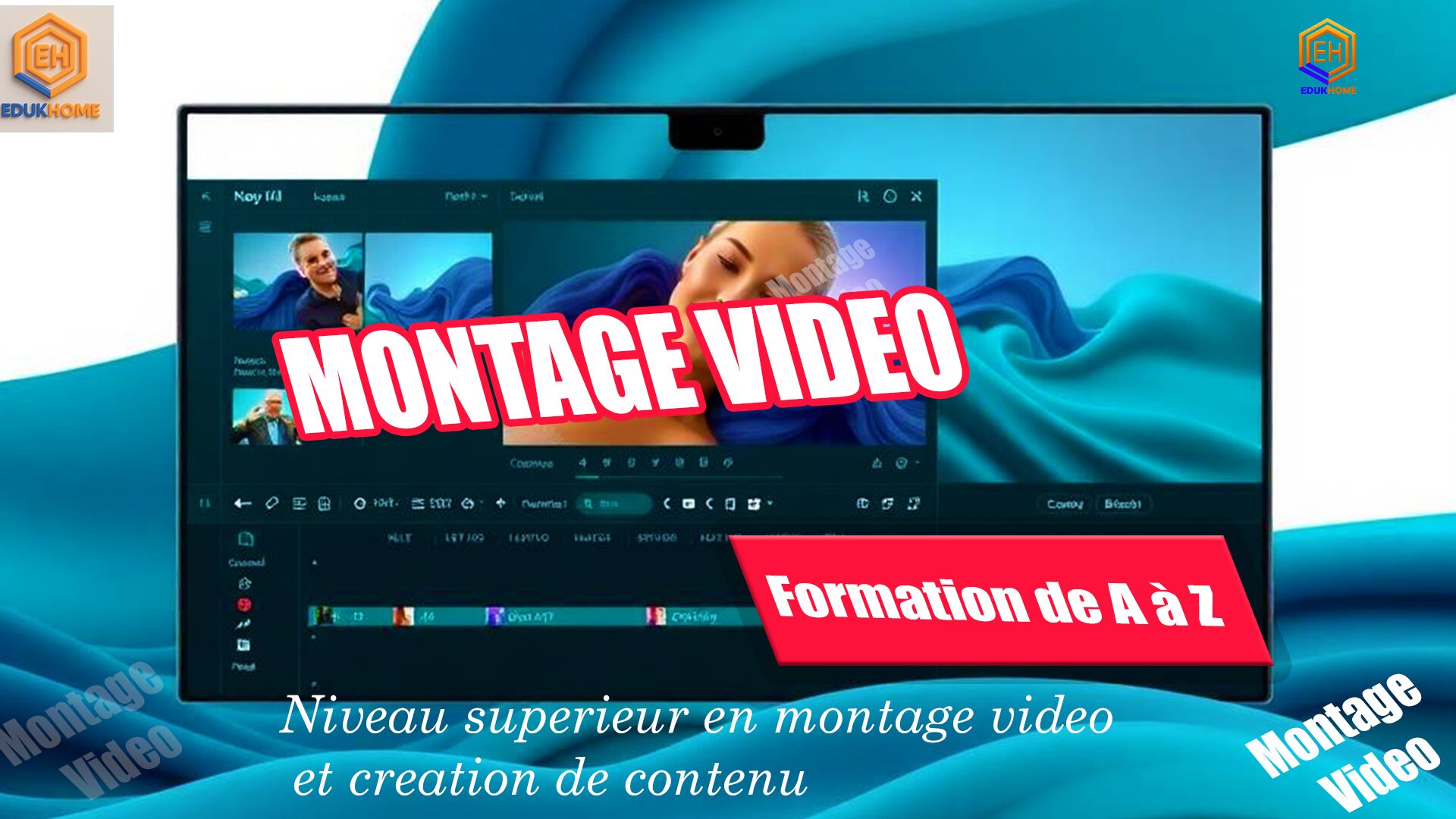
Montage Vidéo
Montage Vidéo avec CapCut Mobile Le Guide Complet Pas à Pas
G
Par Germos
22 000 CFA
45 000 CFA
-51%
S’inscrire maintenant
Prêt à transformer votre avenir ?
Rejoignez des milliers d’apprenants qui ont déjà transformé leur carrière avec nos formations.
Coordonnées
Germos Génie – Formations & Solutions Digitales
Acquérir des compétences. Réussir en ligne. Transformer sa vie.
-
+229 01 97 48 10 82 -
contact@germosgenie.com -
A108, Rue du Savoir, Cotonou, Bénin
Nos Services
Formations pratiques en ligne
Coaching digital personnalisé
Création de sites web WordPress et code
Automatisation & Scraping
Accompagnement au freelancing
Accès rapide
Suivez-nous
Facebook
Twitter
Youtube
Tiktok
Linkedin
Informations
11 résultats affichés
-
Promo !

Apprendre à créer site web avec WORDPRESS
Le prix initial était : 120000,00 CFA.60000,00 CFALe prix actuel est : 60000,00 CFA. Ajouter au panier -
Promo !

Création de Contenu Vidéo IA Monétisé sur TikTok
Le prix initial était : 40000,00 CFA.20000,00 CFALe prix actuel est : 20000,00 CFA. Ajouter au panier -
Promo !
E-MARKETING
Le prix initial était : 50000,00 CFA.30000,00 CFALe prix actuel est : 30000,00 CFA. Ajouter au panier -
Promo !
FORMATION COMPLÈTE SUR CANVA
Le prix initial était : 50000,00 CFA.20000,00 CFALe prix actuel est : 20000,00 CFA. Ajouter au panier -
Promo !
Installation des logiciels Professionnels
Le prix initial était : 80000,00 CFA.15000,00 CFALe prix actuel est : 15000,00 CFA. Ajouter au panier -
Promo !
MAÎTRISE D’OUTILS INFORMATIQUES
Le prix initial était : 60000,00 CFA.25000,00 CFALe prix actuel est : 25000,00 CFA. Ajouter au panier -
Promo !
MAITRISE DE PHOTOSHOP AVEC AI
Le prix initial était : 65000,00 CFA.25000,00 CFALe prix actuel est : 25000,00 CFA. Ajouter au panier -
Promo !
Montage Vidéo avec CapCut Mobile
Le prix initial était : 45000,00 CFA.22000,00 CFALe prix actuel est : 22000,00 CFA. Ajouter au panier -
Promo !
MONTAGE VIDÉO AVEC TÉLÉPHONE
Le prix initial était : 65000,00 CFA.20000,00 CFALe prix actuel est : 20000,00 CFA. Ajouter au panier -
Promo !
SAVOIR CRÉER DES VIDÉO IA AVEC TÉLÉPHONE
Le prix initial était : 50000,00 CFA.10000,00 CFALe prix actuel est : 10000,00 CFA. Ajouter au panier -
Promo !

TIKTOK MASTERY FORMATION AU COMPLET
Le prix initial était : 40000,00 CFA.15000,00 CFALe prix actuel est : 15000,00 CFA. Ajouter au panier